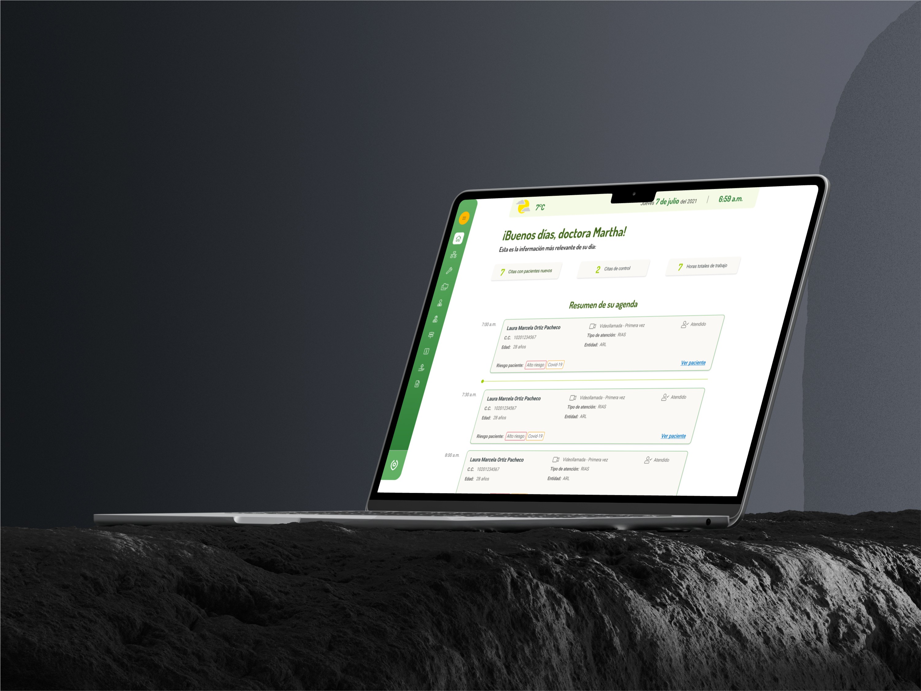
Project Goals
This native app project had a deeply human purpose: caring for people during COVID times. It was especially meaningful to me because it took place during the lockdown when I was isolated. Working with this amazing team at such a great company helped me realize that we are not truly alone and that many people are looking out for us. This project was important to me because I put in my best effort and all my knowledge into growing, learning, and designing solutions for those affected, who, like me, didn't want to feel alone.
Role
Sr. UI/UX Designer
Duration
June 2020 - October 2021
Tools
Figma, Jira, Photoshop, Illustrator, Sketch, Miro.
Processes
End to end, Discovery, Workshops, SWOT, Benchmarking, Research, Flows/ Wireflows, Information Architecture, Wireframing, Prototyping, Design System, Usability Testing, Leadership Experience.
Problem
People were experiencing increased feelings of depression due to the effects of COVID-19 and isolation, resulting in declining health and diminished mental stability.
Solution
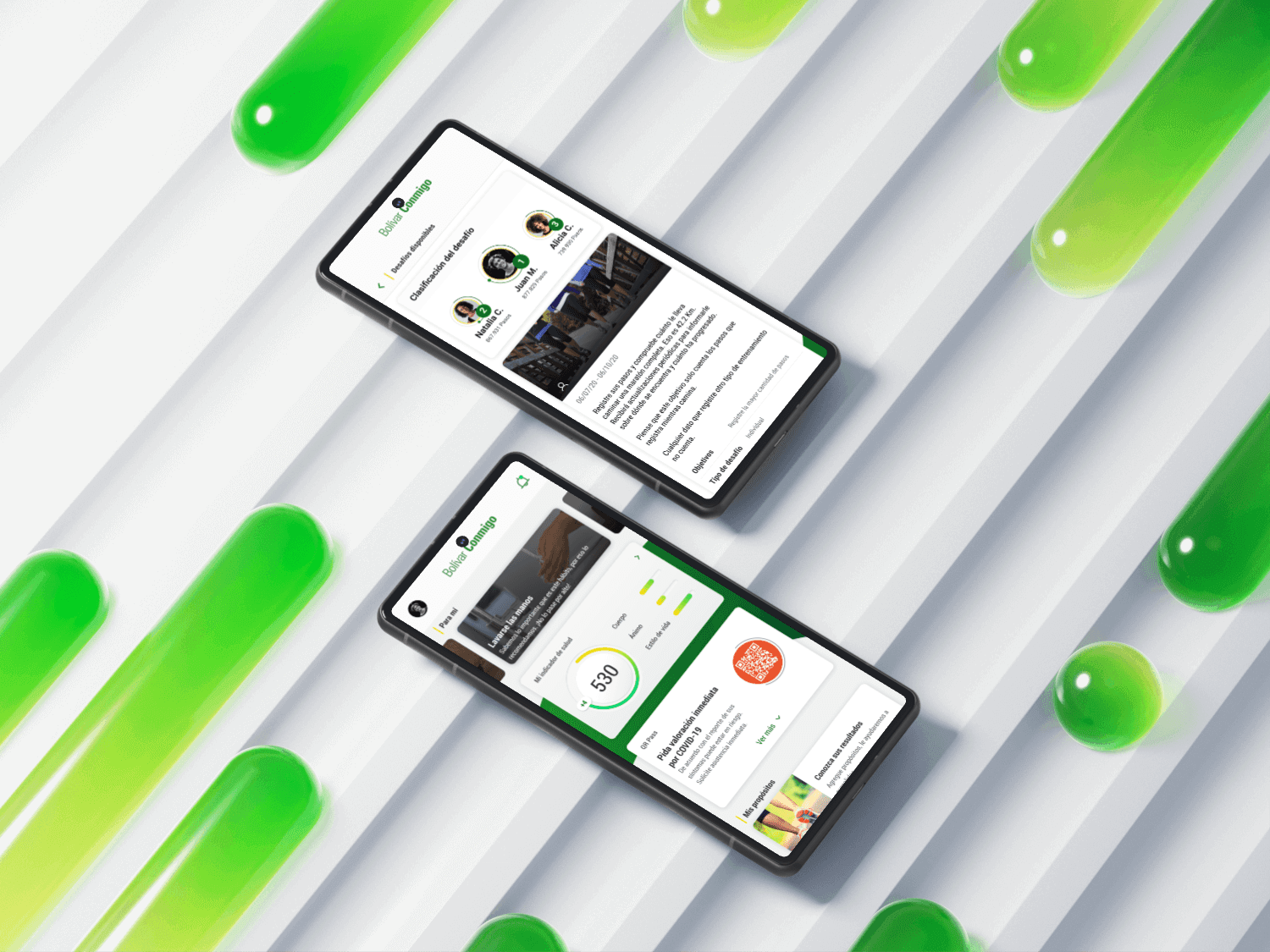
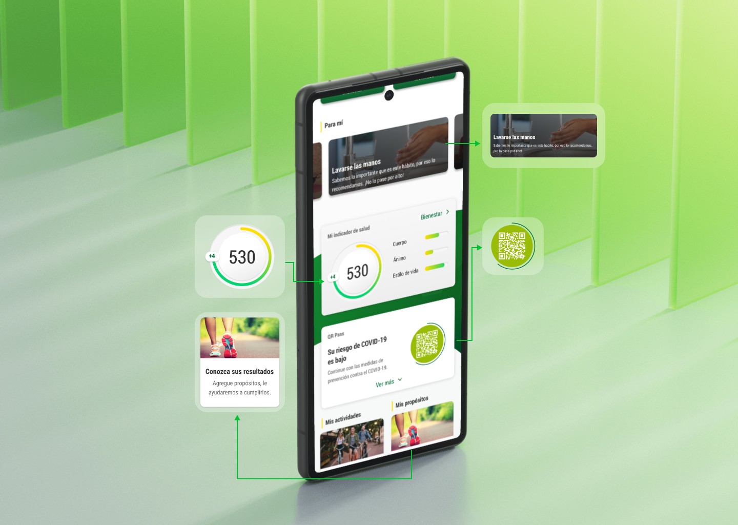
Developing a native, free app that tracks mental and physical symptoms, provides motivational coaching, and generates virtual challenges to facilitate social interaction and reduce feelings of isolation.
My Role in Bolívar Conmigo
Benchmark
I was in charge of investigating and comparing various key aspects of apps related to Bolívar Conmigo, particularly those offering training and fitness options.
Planning
We employed Scrum and Agile methodologies, so I actively participated in the entire process, including estimating dates and achieving sprint goals.
Wireframing
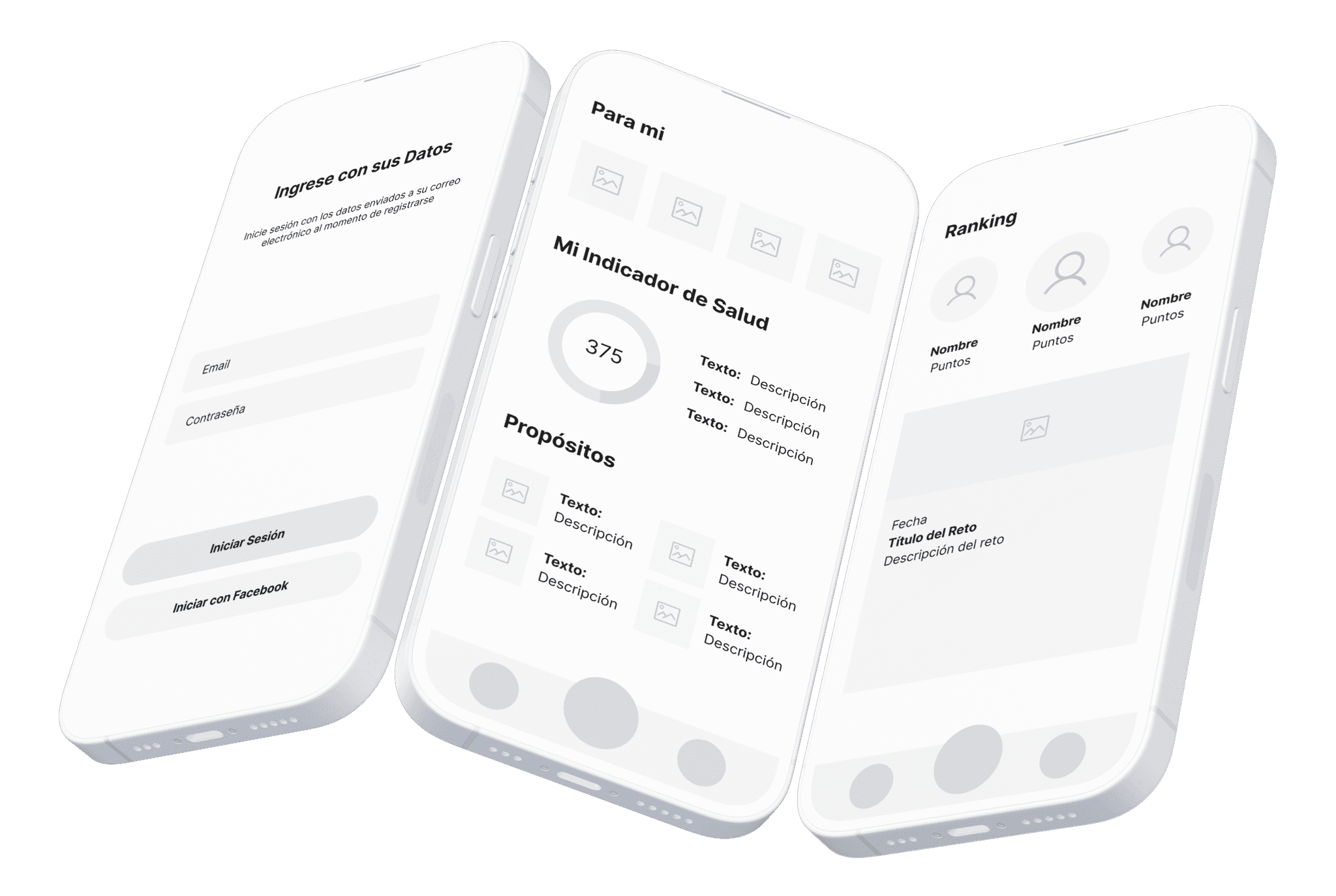
In the initial scratch and low-fidelity wireframe stages, we gained valuable insights that provided a clearer idea of all the elements we intended to include in the app.
Benchmarking
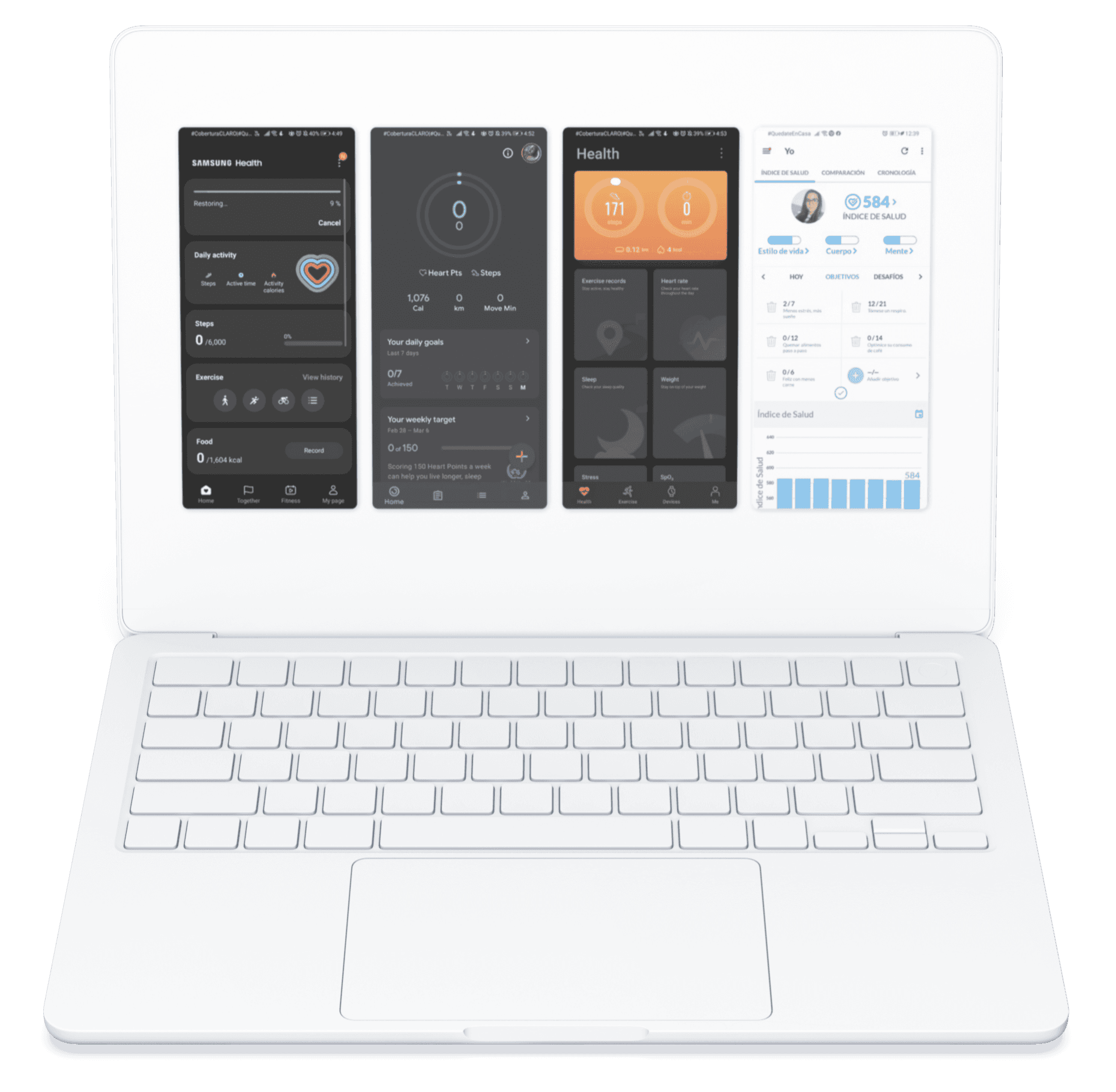
This aspect played a crucial role in the development of Bolívar Conmigo. We evaluated several prominent health apps, including the renowned Swiss application Dacadoo, Google Fit, and Samsung Health, among others. By examining these leading platforms, we aimed to incorporate best practices and innovative features to enhance our app's functionality and user experience.
Inspiration
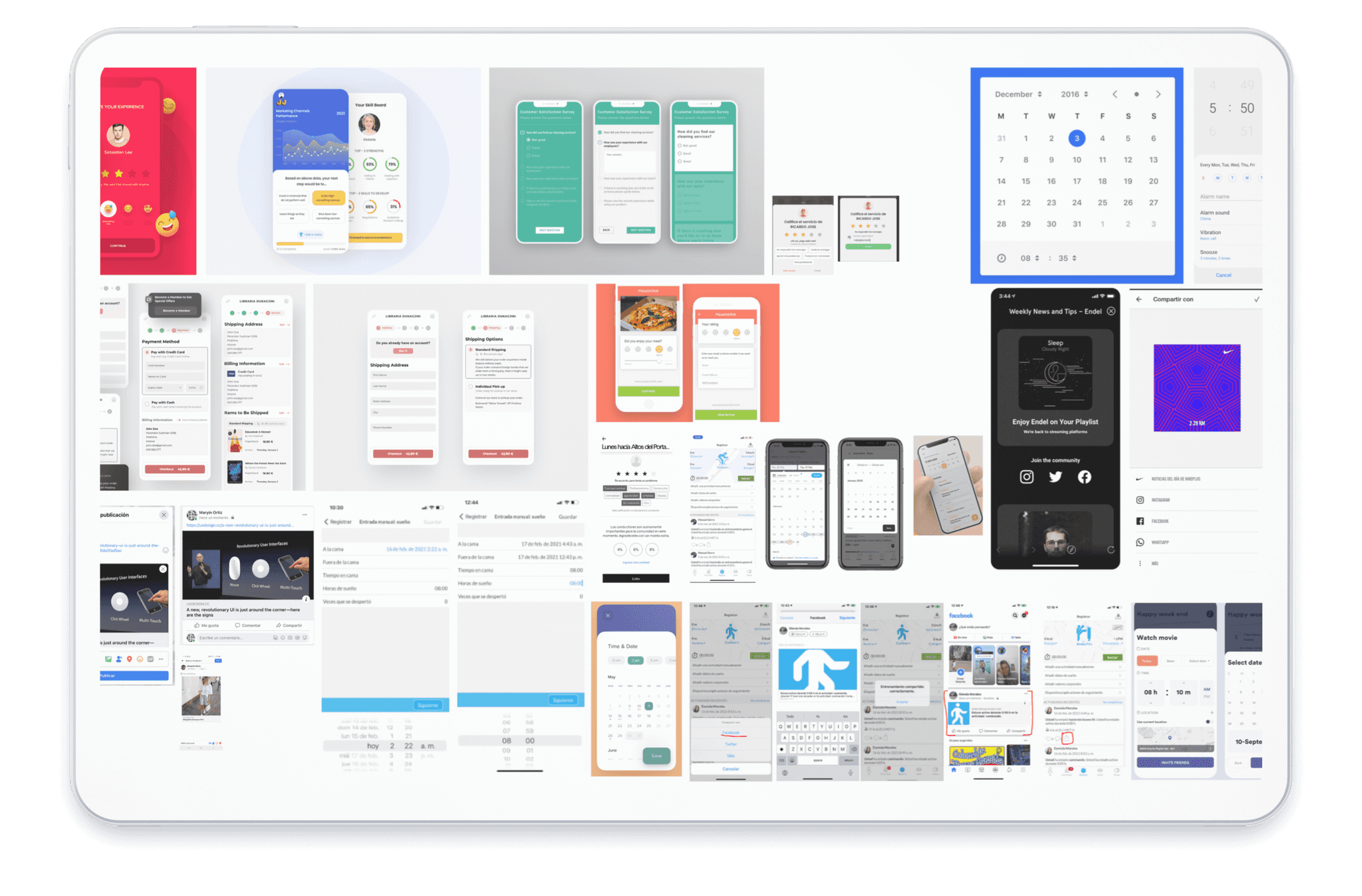
This was a critical aspect that all designers needed to consider. However, many were hesitant to discuss how many references they required to arrive at an outstanding concept. By thoroughly exploring these references, we were able to develop an innovative and fresh app. This approach also contributed to the creation of an impressive user interface.
Planning
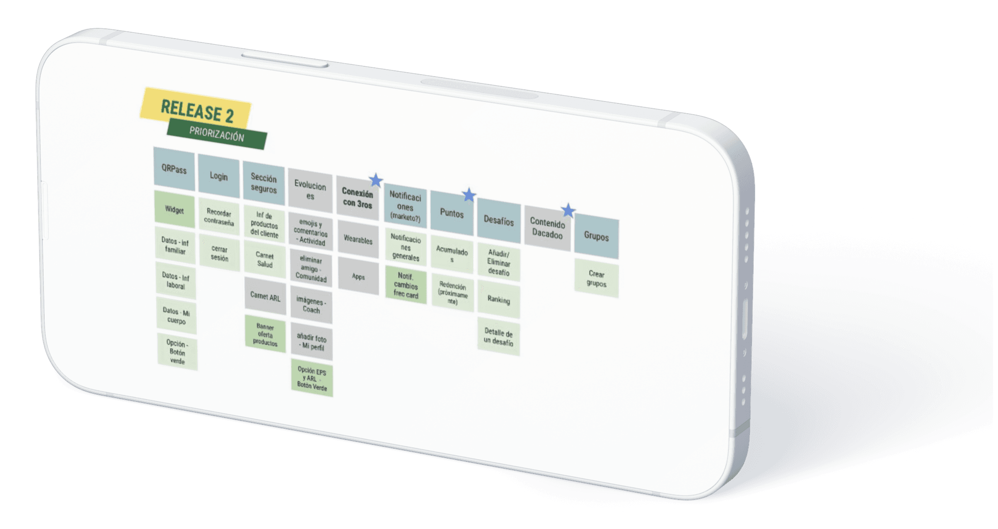
This was an extensive process that required a structured methodology to ensure the project's success. To achieve this, we adopted Agile methodology with Scrum processes. We estimated timelines and worked in sprints, which helped us organize releases more effectively and maintain clear communication throughout the project. This approach facilitated a more efficient workflow and ensured that each phase of development was well-coordinated.
Native Mobile Wireframes
Despite having a specialist UX team, we needed to iterate and refine our initial approach. Through a process of exploration and feedback, we continuously improved our initial design. As a result, we were able to refine the initial concept and develop wireframes that more accurately represented the final vision for our product.
Native Mobile Prototype
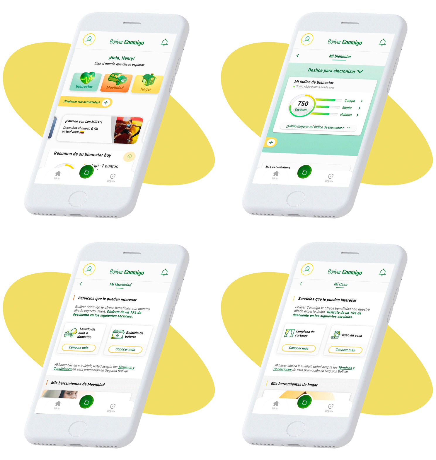
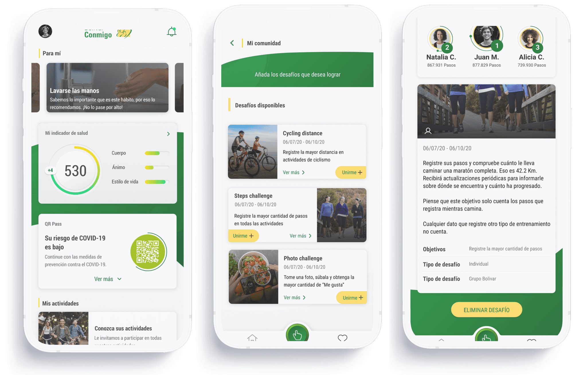
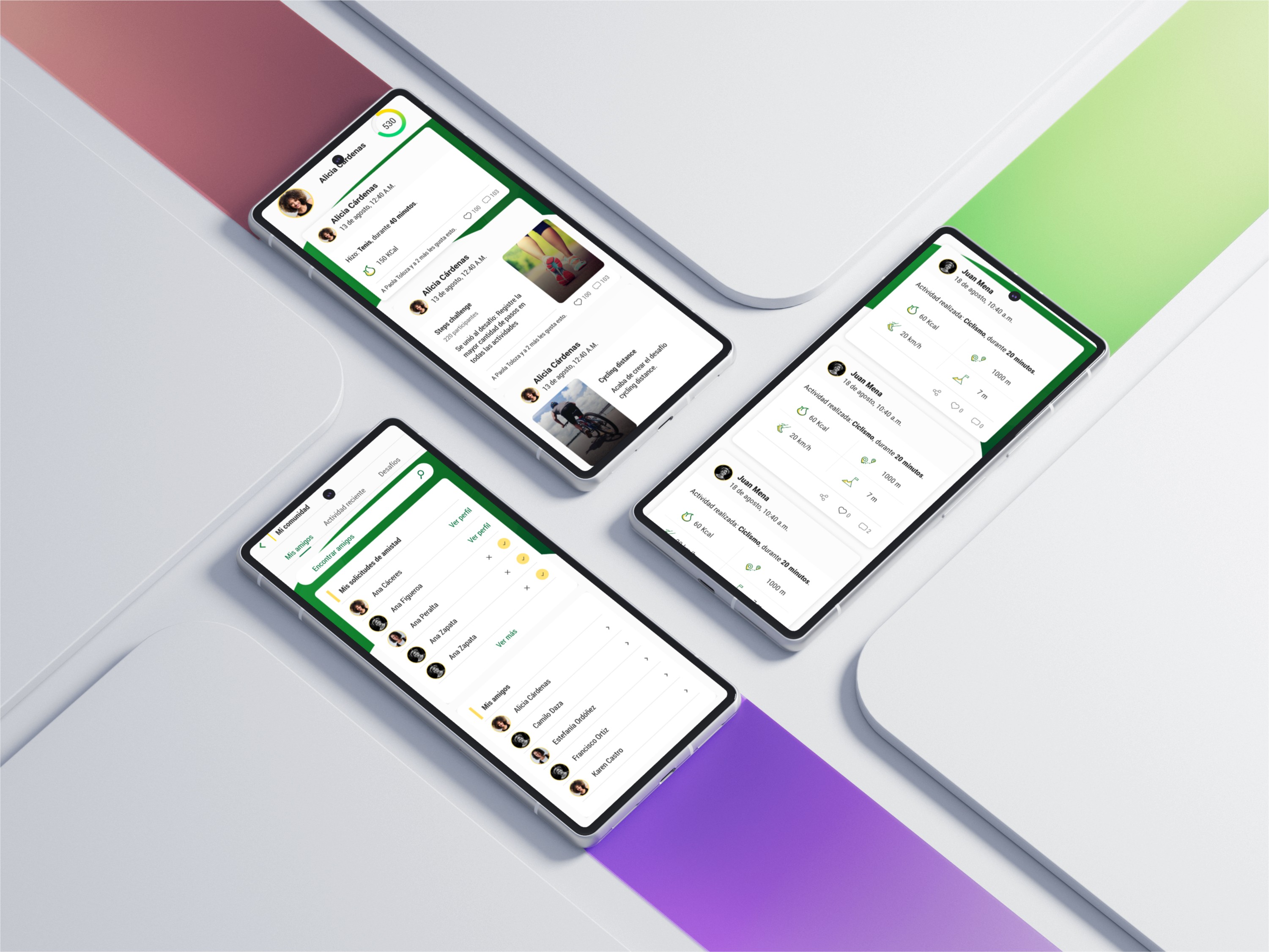
After finalizing the wireframes, we proceeded to implement the branding colors and develop a visual identity for the app. We aimed to incorporate shapes and gradient backgrounds that would capture users' attention while maintaining a clean design that respected white space. Our goal was to create a look that was both professional and appealing to a younger audience. The outcome was impressive; the app was well-received and garnered positive reviews from users.
Design System
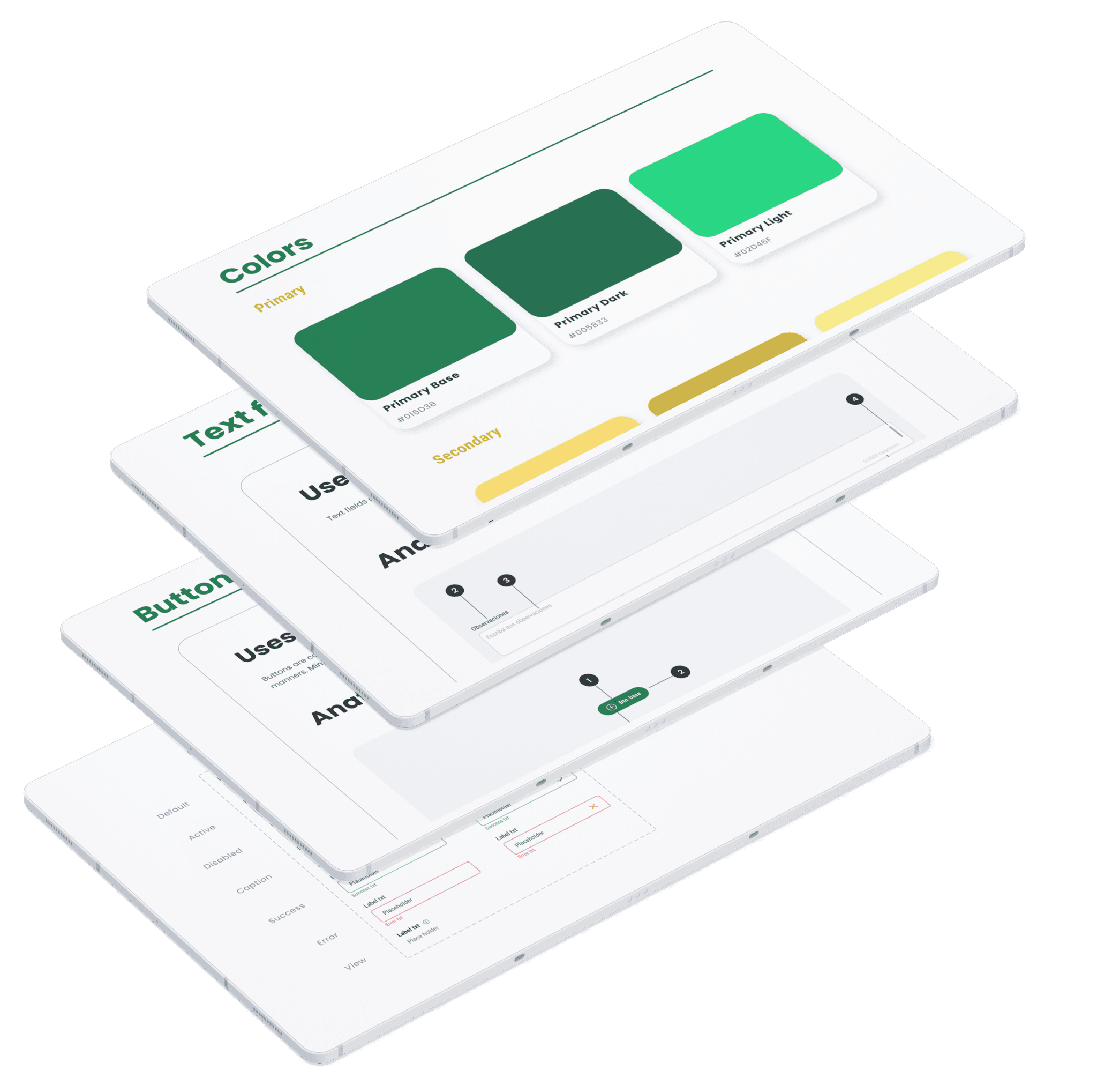
Achieving a design that adhered to the branding style was challenging. Initially, we found that the "Green" color used by Seguros Bolívar was too dark and conveyed a dated brand image. Through extensive research and user interviews, we discovered that this color did not align with the modern, updated look we aimed for. We experimented with various lighter shades and gradients and ultimately achieved a result we were excited about. These new design elements were then incorporated into the company's Design System, enhancing its visual identity.
Handoff & Organization
This app was extensive and has more than 600 screens. Due to its density, we had to be careful about how we shared these elements not just with the client, but also with developers and the people in charge of QA testing. Initially, we decided to categorize it by functions such as "registration process," "login," "home," etc. However, when we noticed it was crashing, we had to separate it into two files. The first one contained the flows, and the second one was the functional prototype.
Downloads
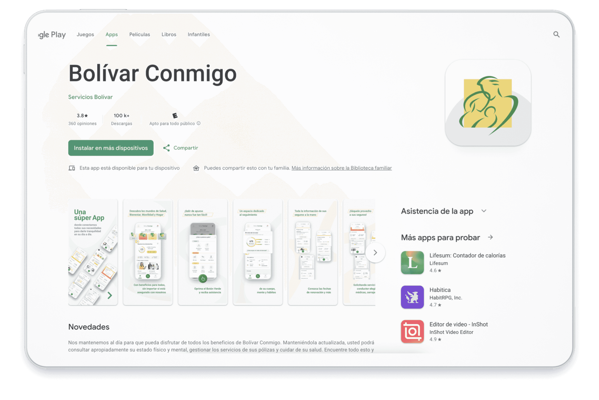
Six months after completing this project in 2020, it had accumulated over 5,000 downloads with a rating of 4.7. Fast forward to 2024, and it has surpassed 100,000 downloads. It is available on both the Google Play Store and the Apple App Store. I believe we delivered a strong product that effectively addresses users' needs and provides relief for various challenges they face in their lives.
